Evangelista Grace
Simple CSS Typography
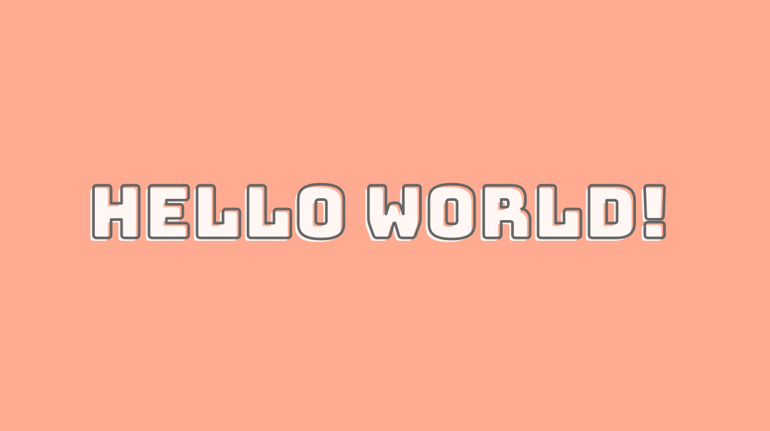
I have always been awed by CSS typography. I recently stumble upon Scrimba, a code learning website and was drawn to the typography displayed for the course title. Realizing it was something fairly easy to recreate, I jumped to Codepen and started typing out some CSS to create a similar text effect. You’ve probably seen this text effect in some places around.

It’s what I call a ‘Stroke and fill offset text’. Here’s my simple approach in recreating something similar.
The Markup
We’ll need two sets of the same text, one will be styled as the outline/stroke and the other will be styled as the fill. For this we will place two divs inside a container, one with a class .stroke and another with a class .fill.
<div class="container">
    <div class="fill">
        <h1>HELLO WORLD!</h1>
    </div>
    <div class="stroke">
        <h1>HELLO WORLD!</h1>
    </div>
</div>
The idea here is to make the div with .stroke to overlap the div with .fill. Here we can make use of the relationship between relative and absolute positioning and add some paddings to the absolute-positioned div to give it the ‘offset’ that it needs.
The CSS
For the font, I’m using Bungee from Google Fonts but any thick font would do. We import the font we want and set some CSS defaults.
@import url("https://fonts.googleapis.com/css2?family=Bungee&display=swap");
* {
  box-sizing: border-box;
  padding: 0;
  margin: 0;
}

body {
  background-color: #FFAB91;
}
For the sake of this tutorial, or any tutorial, I prefer to keep things centered vertically and horizontally on the page. For this, I’ll be using flexbox inside .container.
.container {
  display: flex;
  flex-direction: column;
  flex-wrap: wrap;
  justify-content: center;
  align-content: center;
  height: 100vh;
}

.container h1 {
  font-family: 'Bungee', cursive;
  font-size: 80px;
}

For the fill text, we’ll simply add a add a fill color to it.
.container .fill h1 {
  color: rgba(255, 255, 255, 0.9);
}

It’s time to put these two texts together! As we know, an absolute positioned element will always be positioned absolute to its first positioned parent. For example, if we added position: absolute with no top or bottom or other position values to .stroke, it will be at the center of its parent .container (due to flexbox styling), just like its sibling, the .fill div, hence overlapping .fill. With a little padding added, we can create an offset effect on the .stroke div. We’ll also add some stroke and fill styling to .stroke h1.
.container .stroke {
  position: absolute;
  padding-bottom: 7px;
  padding-left: 7px;
}
.container .stroke h1 {
  -webkit-text-stroke: 3px #666;
  -webkit-text-fill-color: transparent;
}

That’s it! Thanks for reading.